
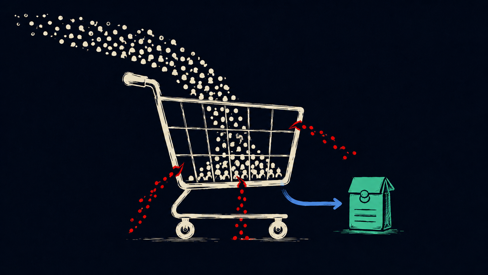
Traffic can make a broken store look healthy. Sessions climb, ad platforms report more clicks, and the sales line barely moves. The usual response is to buy more traffic. That makes the expensive part of the problem bigger.
Conversion rate is orders divided by visits. If 10,000 visits produce 300 orders, the store converts at 3%. Add 10,000 lower-intent visits and 100 more orders, and revenue rises while conversion falls to 2%. That drop may be acceptable if the new orders are profitable. It becomes a problem when more visits produce little revenue, weak margins, or customers who never return.
More visitors do not mean more buyers
A visit from someone comparing gift ideas behaves differently from a visit for “buy size 10 waterproof trail shoe.” Both count as sessions, but only one carries obvious purchase intent.
High traffic often contains a messy mix of audiences:
- Paid clicks from broad targeting
- Social traffic attracted by a post rather than a product
- Organic visits landing on an informational article
- Returning customers checking an order or policy
- Bots, internal traffic, and referral spam that analytics did not remove
The store-wide conversion rate blends all of them into one number. Break it down by acquisition source, campaign, landing page, device, country, and new versus returning customer. A 1% store-wide rate could hide a healthy returning-customer segment and a paid campaign sending thousands of poor-fit visitors to the homepage.
Traffic quality also changes over time. A promotion can bring a burst of bargain hunters. A newly ranking blog post can add thousands of early-research visits. Neither should be judged like branded search traffic from someone looking for a specific product.
The click promised one thing and the page delivered another
An ad for “linen shirts under $60” should land on linen shirts under $60. Sending that visitor to a general menswear page makes them repeat the work they thought the ad had already done.
The mismatch can be quieter. The campaign leads with free shipping, but the landing page does not explain the threshold. The search result promises a product that is out of stock. The social post shows one color, then opens a collection where that color is buried. Each gap adds doubt before the shopper has evaluated the product.
Match the landing page to the query and campaign. Keep the language, price, product group, and offer consistent. If the promise needs an explanation, put it close to the first product decision instead of leaving it in a banner the visitor may ignore.
Shoppers cannot find the right product
A large catalog creates the appearance of choice. Weak search, filters, and category structure turn that choice into work.
Baymard Institute's 2025 benchmark found that 58% of desktop stores and 78% of mobile stores had poor-to-mediocre product-list usability. One example from the research showed Tesco shoppers facing 279 bedding products without filters for price, rating, size, or color. The products existed, but the interface made a suitable one hard to isolate.
The problem also appears when filters use internal language, search cannot handle common synonyms, or a category splits closely related products into narrow dead ends. A shopper who cannot answer “Which one fits me?” does not reach the product page.
Useful product lists usually need:
- Filters based on how customers choose, including category-specific attributes
- Visible applied filters that are easy to remove
- Product cards with price, key variation, stock, ratings, and more than one useful image
- Search that handles product types, features, abbreviations, and common misspellings
- A sensible way back to the same place after viewing a product
The product page leaves expensive questions unanswered
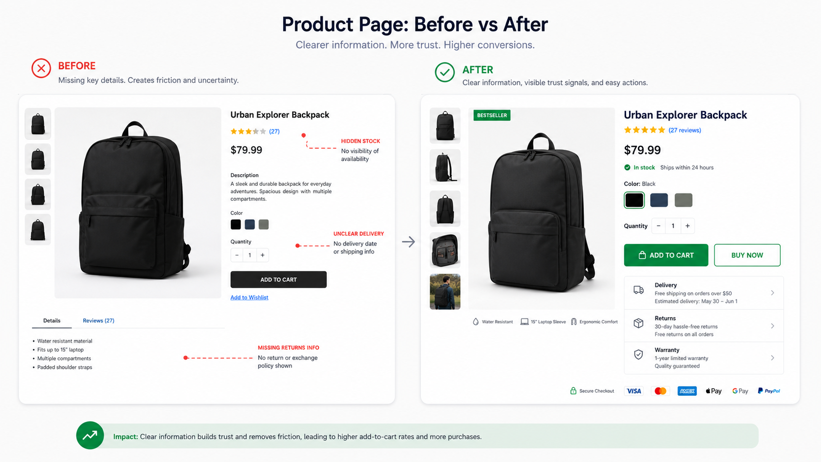
Product photography and a bright Add to Cart button cannot carry the whole decision. Shoppers still need to understand fit, dimensions, materials, compatibility, delivery, returns, stock, and what happens if the product is wrong.
Baymard's product-page research documents a simple Adidas example. A shopper liked a pair of shoes but could not see that her size was unavailable until she opened the size menu. The disappointment arrived late, after she had already invested time in the product.
That pattern shows up across categories. Furniture pages hide dimensions in a PDF. Electronics pages list model numbers without compatibility guidance. Apparel pages show a garment without the model's measurements. Subscription products make the renewal terms hard to find.
Focus the product page on the questions that block this purchase. Put the highest-risk answers near the buying controls. Delivery dates, return terms, available sizes, total price, and stock status should not require a hunt through tabs and footnotes.
The mobile store is slower and harder to use
Mobile traffic can dominate a store while mobile sales trail far behind. A smaller screen, slower connection, heavy product media, sticky widgets, and clumsy forms expose problems that desktop shoppers can tolerate.
Speed belongs in the conversion discussion. Deloitte and Google analyzed mobile data across retail and other sectors and found that a 0.1-second improvement correlated with an 8.4% increase in retail conversions and a 9.2% increase in average order value. That is a multi-brand study. Results like it won't automatically repeat at every store.
Google's current Core Web Vitals targets give teams a practical floor: Largest Contentful Paint within 2.5 seconds, Interaction to Next Paint at 200 milliseconds or less, and Cumulative Layout Shift at 0.1 or less, measured at the 75th percentile and split by mobile and desktop.
Common e-commerce offenders include an uncompressed hero image, a product gallery loaded all at once, review and chat scripts competing for the main thread, font files blocking the page, and personalization tools that move the layout after the shopper tries to tap.
Checkout introduces the bad news too late
A shopper who adds to cart has shown intent. Checkout can still erase it with fees, forced account creation, delivery uncertainty, payment failures, or a form that asks for more than the order needs.
Baymard's current collection of 50 studies puts the average documented cart abandonment rate at 70.22%. Some abandonment is ordinary browsing and comparison. A meaningful share comes from problems a store can fix.
Show the likely total before checkout when possible. Offer guest checkout. Ask for the fields required to take payment, deliver the order, and prevent fraud. Keep optional account creation for the confirmation step. Explain why unusual information is required.
Small details matter here: preserve information after validation errors, allow card numbers typed with spaces, and use the right mobile keyboard for the field. Do not make a shopper press a hidden Apply button to save an address or shipping option. These fixes are less glamorous than a homepage redesign and closer to the money.
What documented underperformers changed
The examples below are historical snapshots published by the companies or their partners. They show a measured gap and the work used to close it. They do not describe how these sites perform today.
Swappie connected mobile speed to revenue
Swappie sells refurbished phones. Its team had prioritized new features while mobile performance fell behind. The company measured relative mobile conversion rate, which compares mobile conversion with desktop conversion. Swappie's figure was 24%, compared with 50% for the benchmark cited in its case study.
After three months focused on performance, relative mobile conversion rose from 24% to 34% and mobile revenue increased 42%. The team reported a 23% lower average page-load time, a 55% lower LCP, better image handling, fewer unnecessary third-party scripts, and less unused code.
Swappie connected performance data to a business metric, then gave the team time to remove specific bottlenecks.
Lancôme had traffic that did not convert on mobile
Lancôme reported that mobile traffic had passed desktop traffic in 2016, but the buying experience had not kept up. While 38% of desktop carts became orders, only 15% of mobile carts did.
The company rebuilt the mobile experience as a progressive web app. The published case study reports an 84% reduction in time to interactive, a 15% lower bounce rate, and a 17% increase in conversions.
Traffic growth revealed the gap; faster delivery and mobile interface changes closed it.
Ray-Ban sped up the product journey
Ray-Ban found that page-to-page navigation on product journeys still carried a performance cost. In a 2025 case study, its Aviator product pages had a 4.69-second mobile LCP before prerendering. Prerendered visits brought that down to 2.66 seconds.
For the measured visitors and supported browsers, mobile conversion on those prerendered journeys increased 101.47% and exit rate fell 13.25%. Desktop showed a similar pattern. Those large figures belong to that tested implementation and audience; they should not be copied into another store's forecast.
Find the leak before redesigning the store
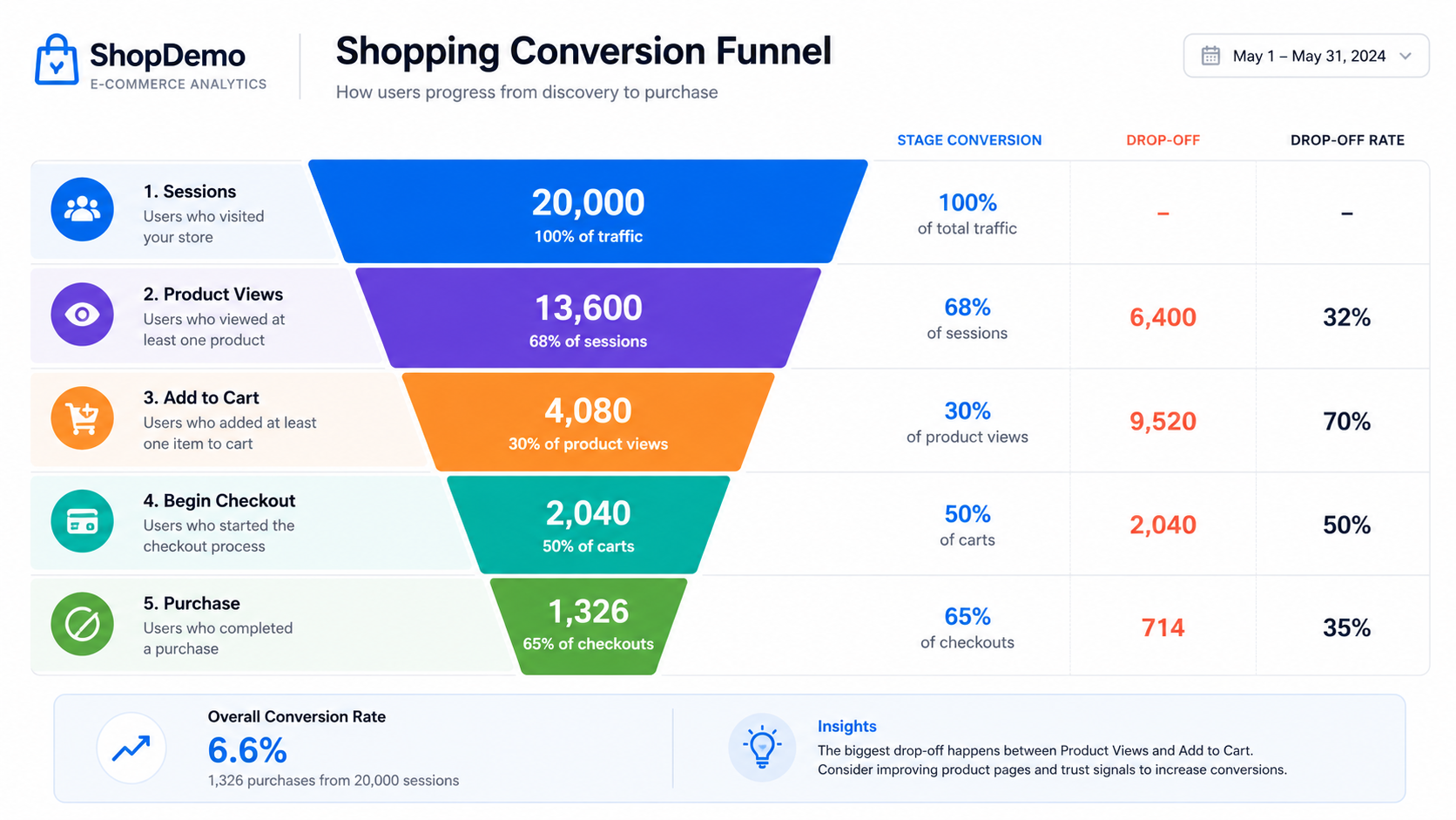
Start with the path a shopper takes:
- Landing page viewed
- Product or collection viewed
- Product added to cart
- Checkout started
- Purchase completed
Track each step by device, source, campaign, landing page, customer type, and product category. Add revenue per visitor, average order value, gross margin, refund rate, and repeat purchase where the data is available. Conversion without margin can reward the wrong campaign or discount.
The first large drop tells you where to investigate. Weak product views point toward traffic or landing-page mismatch. Healthy product views with few add-to-carts point toward discovery, product information, price, or trust. Healthy checkout starts with few purchases point toward costs, forms, delivery, payment, or technical errors.
Analytics shows where shoppers leave. Session recordings, support tickets, on-site search terms, return reasons, customer interviews, and testing on real phones help explain why.
Concrete changes worth testing
Tighten acquisition and landing pages
Send each campaign to the smallest useful product set. Repeat the offer and price conditions on the landing page. Exclude irrelevant paid-search terms. Separate informational SEO traffic from commercial pages when reporting conversion.
Make products easier to narrow down
Add the five common filters when they fit the catalog: price, brand, rating, size, and color. Add category-specific filters such as compatibility, material, capacity, or fit. Show applied filters above the results and keep the shopper's position when they return from a product page.
Remove uncertainty beside the buying controls
Show available variations as visible buttons with stock state. Put the delivery estimate, return window, and total price near Add to Cart. Add measurements, compatibility notes, and image context that answer the most common pre-purchase questions. Use approved reviews and customer photos where they help someone judge the product.
Treat mobile performance as product work
Measure real-user LCP, INP, and CLS by page type. Resize and compress product images. Preload the image that becomes LCP and lazy-load media below the fold. Remove third-party scripts that do not earn their cost. Reserve image and widget space so the page does not move under a shopper's finger.
Shorten checkout without hiding information
Show estimated shipping and fees in the cart, make guest checkout obvious, and drop any field the order doesn't need. Keep promo codes behind a text link so an empty code box does not send shoppers looking for a discount. Test payment failures, address validation, autofill, and recovery after an error on real mobile devices.
Test one diagnosis at a time
Write the expected chain before shipping a change. For example: showing delivery dates beside Add to Cart should reduce uncertainty, increase add-to-cart rate, and leave return rate unchanged. Measure the primary outcome and the guardrails. A lift in checkout completion paired with more cancellations is not a clean win.
A practical two-week start
Use the first two days to build a segmented funnel and confirm analytics events. Spend the next two watching real sessions, reading on-site searches and support tickets, and testing the weakest path on a mid-range phone. Choose one high-volume break with a fix the team can ship safely.
Implement that change, verify tracking, and watch the affected segment. A high-traffic store may collect enough evidence for a controlled test quickly; a smaller store may need more time. Do not call the result early because the first few orders moved in the right direction.
If mobile paid visitors reach product pages but rarely add to cart, work on message match, speed, and product confidence. If add-to-cart is healthy and purchases collapse, work on total cost, guest checkout, fields, payment, and delivery. Choose the work based on the step where your funnel drops.